Samsung Galaxy Note Edge Review: Curve Your Enthusiasm

Samsung’s
Galaxy Note 4 is the best big-screen smartphone on the planet. But what
if you took that great phone and put a crazy curved screen on its right
side that let you control apps, manage notifications, and even act as a
ruler? Would that make it better?
For
the answer to that question, see Samsung’s new Galaxy Note Edge. The
latest in Samsung’s seemingly endless parade of smartphones to make a
debut this year, the Note Edge is the company’s top-of-the-line handset,
and, boy, is it priced as such.
The
Note Edge costs $400 with a two-year contract through AT&T, $35 a
month for two years on Sprint, or $950 unlocked. Verizon, T-Mobile, and
U.S. Cellular haven’t announced pricing for the Edge, but expect the
handset to cost about the same amount on those carriers as well.
Now, the question is, should you spend such a big chunk of change on a Galaxy Note 4 with a curved screen?
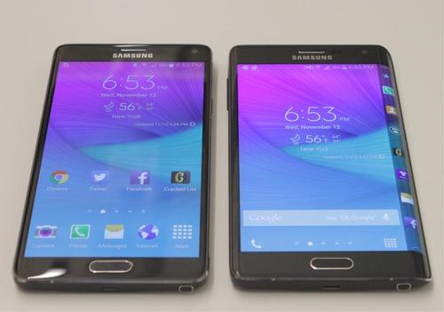
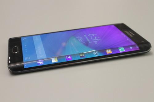
Size and designI’m
not exaggerating when I say that the Note Edge is basically a mutated
Note 4. Both handsets have the same metal frame and soft-touch,
faux-leather removable back panels. Both let you insert a microSD card.
Where
the two differ is the curved screen, obviously, and button placement.
For the Note 4, Samsung wisely chose to position the power button on the
phone’s right edge, making it easily reachable with one hand.
 Because
the Note Edge’s screen takes up the phone’s right side, however,
Samsung placed its power button along its top edge, meaning that you
have to reposition the Edge in your hand to lock its screen or turn it
off.
Because
the Note Edge’s screen takes up the phone’s right side, however,
Samsung placed its power button along its top edge, meaning that you
have to reposition the Edge in your hand to lock its screen or turn it
off.
The
Edge’s curved screen also means that the handset is a hair wider than
the Note 4. The Edge measures 6.0 × 3.2 × 0.33 inches, while the Note 4
measures 6.0 × 3.1 × 0.33 inches. Despite that, the phone is actually
more comfortable to hold, as the slope of the curved screen contours to
the shape of your hand.
It’s still not exactly easy to use the Edge with one hand, but the screen’s curve certainly helps.
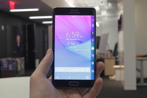
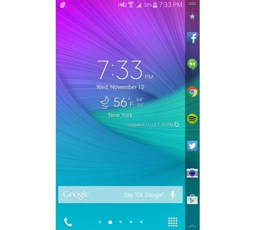
ScreenThe
Note Edge’s curved screen may look like it’s separate from the phone’s
main display, but the two are actually one panel. As a result, apps look
as though they cascade over the side of the Edge.
Unfortunately,
the Edge’s main viewing area is slightly smaller than the Note 4’s, 5.6
inches vs. 5.7 inches. At times the Edge’s cascading effect makes apps
look as though they are being cut off, even though they aren’t. It’s a
rather odd optical illusion that takes a bit of getting used to.
Like
the Note 4, the Note Edge’s main viewing area is absolutely gorgeous.
Both phones use the same Super AMOLED (active matrix of organic
light-emitting diodes) display technology, which means colors look
brilliant, though somewhat exaggerated. And thanks to its high pixel
resolution, images, photos, and text all look incredibly sharp on the
Edge’s screen.
The Edge’s side screen, which Samsung calls the Edge Screen, offers equally crisp, vibrant visuals.
Using the Edge ScreenThe
Edge Screen is meant to make navigating your phone easier, while
providing you with notifications and news updates. It delivers on all
three counts.
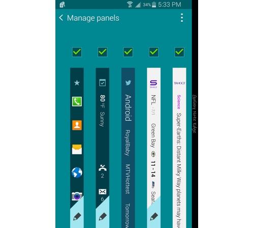
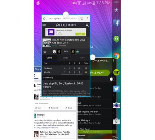
The
Edge Screen can display seven different “panels” such as a main panel
with customizable shortcuts for favorite apps, a notifications panel, a
Twitter Trends panel, panels for Yahoo Sports, and others.
Of
all the panels, I found the main panel to be the most useful, as I
could jump between apps by simply tapping their icons. Normally, to
switch apps in Android, you have to exit an app by pressing the home
button and tap the icon for the app you want to open. Sure, the Edge
Screen eliminates only a single step, but it’s surprisingly helpful.
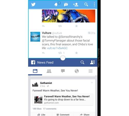
The
notifications panel was probably my least favorite, as it simply
duplicated the app notifications I received in the Edge’s drop-down
notifications drawer.
So
if I get an email, I’ll see the email icon light up on the Edge Screen
and at the top of the main display. You can prevent specific
notifications from appearing on the Edge’s screen, which is useful, but
the fact that there is any overlap at all is annoying.
There
is, however, one thing about the notifications panel that I do
appreciate, and that’s the fact that things like incoming calls will
appear on the Edge screen only if you’re already using another app. That
means you won’t be interrupted by your crazy Uncle Ted’s incessant
calls while you’re watching super serious documentaries like Ancient Aliens.
And,
yes, the Note Edge’s palm rejection is top-notch, so you won’t have to
worry about accidentally touching the Edge Screen while using the main
display.
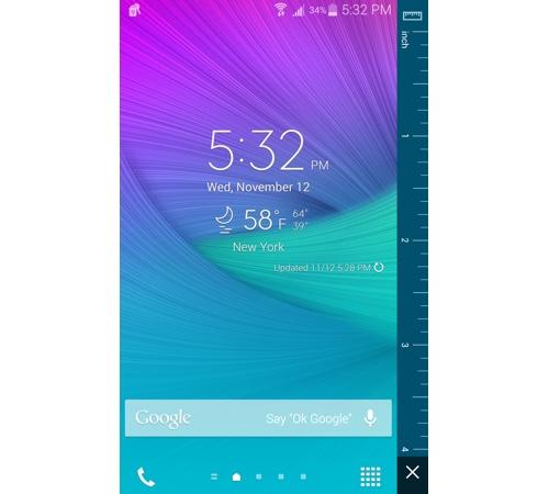
A useful toolIn
addition to the added convenience the Edge’s side screen offers, it
also provides a handful of practical tools, including a ruler and quick
access to the phone’s flashlight, stopwatch, timer, and voice recorder.
Enable
the Edge’s Night Clock feature, and the handset’s Edge Screen will act
as a digital clock for up to 12 hours, while the main panel stays dark.
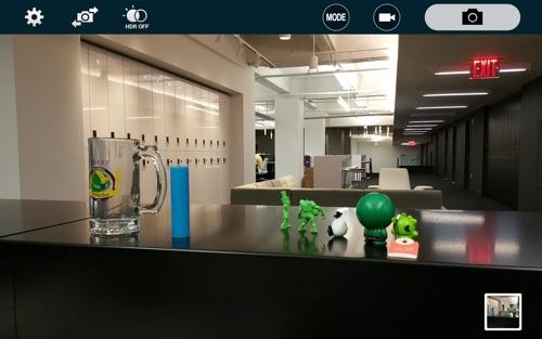
Even
non-Edge apps are improved thanks to the Edge Screen. The camera app,
for example, sees its controls moved from the main screen to the Edge
Screen, giving you more space to frame your photos. The Edge’s native
video player and music apps also move to the Edge Screen. Even Spotify
can be controlled from the Edge Screen.
There’s
just one potential problem with the Note Edge’s design, and that’s the
fact that the Edge Screen is on the phone’s right side. While that’s
perfect for right-handed folks, the lefties out there will feel burned.
To
address this, Samsung has added a 180-degree setting to the Edge that
flips the screen when you rotate the phone 180 degrees so that the Edge
Screen is facing your left hand. Unfortunately, it’s an inelegant
solution, as it means that the Edge’s power and home buttons are also
flipped.
InterfaceAside
from the Edge Screen and its associated apps, the Note Edge’s software
is exactly what you’ll find on the Galaxy Note 4. Both phones run
Samsung’s TouchWiz interface on top of Google’s Android 4.4 KitKat
operating system, though an upgrade to Android Lollipop is forthcoming.
TouchWiz continues to be a rather heavy-handed interface and can be confusing to navigate for first-timers.
Still,
the software does have its benefits, chief among them the ability to
multitask apps by opening two onscreen at once. Samsung’s new pop-up
apps feature lets you open and resize as many individual apps as you
want and move them around the screen.
The
downside to this feature is that it doesn’t work with every app. So
some apps like Spotify can be resized, while others can’t.
Like
the Note 4, the Note Edge also includes Samsung’s impressive S Pen
stylus, which lets you do things like take handwritten notes, take a
screenshot and write on it, and easily crop images.
Best
of all, though, is the ability to select text with the S Pen the same
way you would with a computer mouse. Seriously, I can’t express how
helpful this feature is.
The
Edge also comes with Samsung’s S Health fitness app, which, when used
in conjunction with the handset’s rear-mounted heart-rate monitor, can
provide you with your pulse, blood oxygen level, stress level, and even
measure the amount of UV exposure you’re being subjected to.
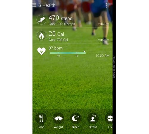
I’m
not exactly sold on the accuracy of the phone’s heart-rate monitor, nor
do I think it can accurately measure my stress levels. So take any
health-related readings from the Edge with a grain of salt.
CameraThe
Note Edge packs the same 16-megapixel rear camera as the Note 4. What’s
more, it also gets the same optical image stabilization (OIS), which
means that you don’t have to worry about your hands shaking while taking
photos or shooting videos, because the Edge’s camera will physically
move its lens to compensate.
In other words, your pictures look less blurry than usual if your hand moves a bit while you take them.
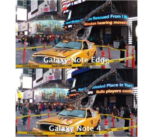
Since
the Note Edge and Note 4 have the same cameras, they capture nearly
identical photos. Details were sharp, and colors were vibrant, though a
bit exaggerated. Photos taken in low-light settings, however, were a bit
dim.
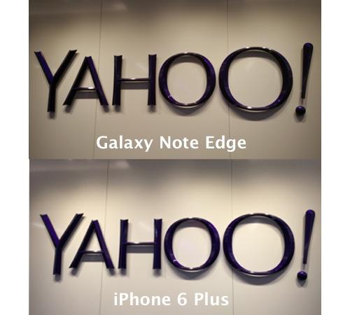
Apple’s iPhone 6 Plus
offers an 8-megapixel iSight camera that shoots similarly detailed
photos but manages to capture colors more accurately. On top of that,
the big-screen iPhone also fires off pictures faster than both Notes.
BatteryWhile
the Note 4 comes with a 3,220 mAh battery, the Note Edge packs a
smaller 3,000 mAh battery. The difference between the two is negligible,
though, as I was still able to get through one day and well into the
next with the Note Edge.
If
you are running low on juice, however, you can always enable the Note
Edge’s Power Saving or Ultra Power Saving modes. Power Saving cuts back
on the Edge’s power consumption by reducing the phone’s processor
performance and restricting background data, so you’ll have to manually
pull down email and social media updates.
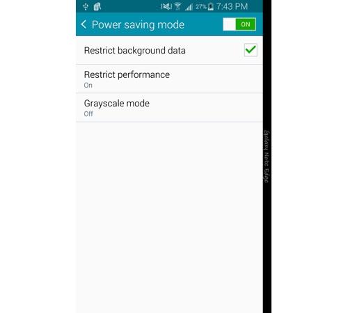
Ultra
Power Saving mode, on the other hand, goes all out to save your battery
by limiting the apps you have access to and setting the display to
grayscale.
If
you do happen to run out of power, you can plug in the Note Edge’s Fast
Charging power adapter, which can fill your phone with 50 percent
battery life in 30 minutes. To see such fast charging, though, your Edge
will have to be running seriously low on juice, as the battery meters
the amount of energy it draws in.
Should you buy it?The
Note Edge’s Achilles’ heel is also its defining characteristic. In
order for apps like Twitter and Yahoo Sports to take advantage of the
phone’s screen, developers have to make their software compatible with
the Edge Screen. That means more work just to make an app use a single
feature on a phone that won’t be a high-volume seller.
Which means that the number of apps that are compatible with the Edge Screen will likely remain small.
To
recap, the Note Edge is essentially a Galaxy Note 4 with a curved
screen that’s gimmicky, though it does add some extra usability. The
Note 4 is the best big-screen smartphone on the market, and the idea
that it could be even better is intriguing, but I just can’t bring
myself to say that the Note Edge is a superior device.
Yes,
it does make jumping between apps easier, and being able to take photos
without half the screen being covered by the camera controls is great.
Being able to control my music from the Edge Screen is pretty
convenient, too.
But
in the end, the Edge’s price is simply too high to recommend over the
Note 4. The benefits just don’t outweigh the $100 premium the Edge has
over the Note 4.
If
you’re a serious Samsung fanboy and have the money to burn, the Note
Edge won’t disappoint you. But for everyone else out there, stick with
the Note 4.